Google I/O: a short summary of what’s next in Android — Part I

At Google I/O 2019, Thomas Kurian made the introduction of the Developers Keynote. He shared his path, as a way to show that everything is possible when you dream big; and most importantly, doing so, he motivated an entire auditorium to do more, to try out new technology and pursue new ideas.
According to him, this is the perfect time to be a developer:
There’s never been a better time to be a developer — there are three important reasons that I believe that this is true:
- New user interfaces such as voice, camera, and speech. Are making computing ambient available to humans wherever they are, all the time, and enabling much richer forms of interaction that were possible through keyboards and mice
- … the assistant provides great facilities to make computing much more helpful and convenient for people.
- With the advent of cloud computing, we offer incredible effective tools for developers, whether that’s the convenience of serverless and container technology or the ability to infuse artificial intelligence and machine learning into your applications
And this is completely true.
We’re on the age where we just need a laptop, internet connection and power to do almost everything. So what’s stopping you?
Introduction
This is a resume of what’s presented during the talk What’s New in Android with Chet Haase, Romain Guy, and Dan Sandler.
Android Q
For the next version of Android Q, more than 50 new features were added to this release. This first chapter is dedicated to the system UI, and you can expect two more this week — one about the Android platform and the other about privacy.
System UI
Bubbles

System Alert Windows (or shortly SAW’s) are used by several applications nowadays. Although the best-known example might be Facebook messages, truth to be said, probably, half of the applications on your device should have some sort of functionalities that uses this feature — if it’s not to show chat heads, it might be a video on top, etc.
Depending on which OS version you’re using you may need to ask for special permission (Settings.ACTION_MANAGE_OVERLAY_PERMISSION), but once granted you can draw whatever you want over the screen.
This has two direct problems:
- It will use up resources; you’ve got multiple views being drawn one on top of the other continuously.
- It’s a bit tricky for privacy since you can be on top of other application and record what the user is doing.
To overcome this, Q follows the approached same approach of the latest Android Go versions and when an application is installed, it gets the permission:
Settings.canDrawOverlays()
disabled by default.
To overcome this, we now have a new solution — Bubbles. Visually is quite similar to the chat notification that we’re used to on Facebook Messenger. Although it has been available since the early beta releases of Android Q, you’ll need to enable it via the developer settings or the ADB:
adb shell settings put secure experiment_enable_bubbles 1
adb shell settings put secure experiment_autobubble_all 1
Using Bubbles seems to be pretty straightforward, you just need to post a notification, add an icon and an activity to embed (which will be added inside a floating window when the user clicks on the bubble).
notification.setBubbleMetaData(new Notification.BubbleMetada.Builder()
  .setIcon(Icon.createWithAdaptativeBitmap(bitmap))
  .setDesiredHeight(600)
  .setIntent(bubbleActivityIntent)
  .build());
Note: according to Dan Sandler eventually system alert windows will become deprecated and all apps will use Bubbles. So don’t forget to add this change to your project scope on the upcoming months.
For more information, watch: What’s New in the Android OS User Interface
Dark theme

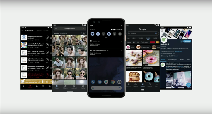
It’s now a core feature of the OS — it’s longer tied to the time of day, so if you’re using MODE_NIGHT_AUTO_TIME you should update your code that will soon be deprecated.
The dark theme was announced during the keynote itself and it brings us:
- Happiness 🙌
It was something that developers and users have been asking for a long time — although this is always subjective, truth to be said, it seems that a darker theme it is more pleasant since it doesn’t harm our eyes as much as using a light one. - Saves up battery
Brighter pixels use more resources than darker ones. With this, if your device is running low and it enters on saving mode; dark mode will automatically be triggered in order to save up the light needed to bright your screen pixels.
How to do it?
- The easiest way is to just use Android themes:
//Probably this is the one that you already extend on your app Theme.appCompat.DayNight //It will use the same theme as the OS is using Theme.DeviceDefault.DayNight //Just use the accent color ThemeOverlay.DeviceDefault.Accent.DayNight - Let the OS handle it by you. You can set:
android:forceDarkAllow=”true”And the OS will automatically invert the colors.
Don’t forget to run over every case on your app, since this is not a 100% bulletproof mechanism, there might be cases where you want to leave it as it is. For that, you just need to find those views and disable force dark mode for them:
view.setFoceDarkAllowed(false) - You can do it manually by creating a specific theme one your app and set it or by using -night resources and configurations.
For more information, watch: Dark Theme & Gesture Navigation
Sharing

Performance wise, launching the share sheet as always been a bit strange — we’ve ended up with different implementations depending on the vendor and, on most times, it was possible to see it being updated with content from other applications through the continuous flickering created by each one of this updates, degrading the user experience.
On the upcoming release the Android team focused on:
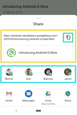
- Designing a content preview on the share sheet to see what’s being shared (it has support for both text and images).
- A new shortcut API focused on performance — no longer the OS opens each app looking for content to add to the share sheet (which is what caused the flickering effect mentioned previously).
- And we now even have an option to copy the content being shared directly to the clipboard.
For more information, watch: What’s New in the Android OS User Interface
Notifications

On each release, we keep having updates on the Android notification system — this time along with the bubbles we’re going to have the concept of priority notifications. And hopefully, reduce the number of interruptions that they make.
With Q we’re going to have two sections (sheets) that will hold different types of notifications:
- Gentle
This type notifies the user about something that does not require any direct input from the user, and can even be seen later on the day. - Priority
Notifications that are important to the user and usually require his attention and/ or input. Similarly, with we currently have on Android P they will be launched as a heads-up notification in order to visually catch the user attention. The application needs to set them with a priority ofIMPORTANCE_HIGHT or IMPORTANCE_MAX and this will be adjusted according to the OS heuristics that include: essential device functions (for instance, running out of battery), communications, alarms, etc.
Of course, as it is now, the user as the final say and he can long press a notification and deliberately change its importance.
Notifications actions
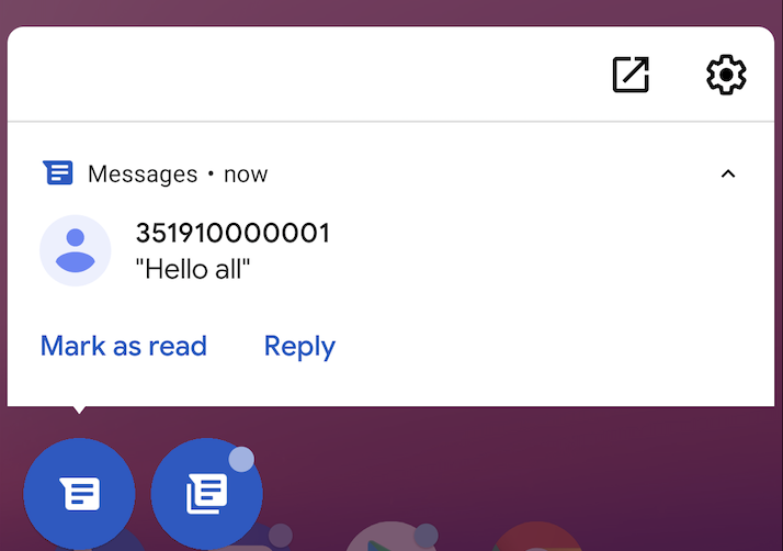
With the goal of providing faster response times, all message applications can now support smart replies. The OS is responsible to include them directly on the notification and it should show several suggestions that can go from small answers to received questions to the integration with external services like opening an address on Google Maps or make a call to a received number.
Briefly, it should be a behavior similar to the one that we currently have on Google Messages.
This can easily be achieved by enabling the MessageStyle notifications (other types must opt-in).
For more information, watch: What’s New in the Android OS User Interface
Gesture navigation

In order to provide the same experience across different vendors, Google partnered with the different OEM’s in terms of creating a standard for gestures an how to interact with the screen. The goal here was to get the best UI paradigms that already exist and add them to the framework in order to make things more reusable and safe.
These shouldn’t be seen strictly as rules but instead, guidelines created to improve the user experience across different devices and OS versions:
- You can draw from edge to edge without any problem, but avoid adding clickable views under the navigation or status bars.
- Left and right areas can support gestures, so you should also avoid putting clickable content there (an example here is to open the navigation sidebar by swiping from left to right the left bar of the screen)
- If you have a use case where it makes sense to use them — you can use exclusion rects in order to say that your app will need that area.
For more information, watch: Dark Theme and Gesture Navigation
Part II is already being written and it should be published during this week. It will be focused on the upcoming new functionalities developed on Q for the Android platform.